Discord’s logo, Clyde, gets a makeover alongside a new font for the company’s sixth birthday. Did you even know the Discord logo had a name? The new logo is Discord’s attempt at making it look a little bit friendlier, as per their Tweet announcing the update. It’s the first logo update since the launch of Discord back in 2015.
Discord’s old logo was actually horizontally asymmetrical and was one of the things the design team at the company wanted to fix for a few years. A logo that’s not perfectly symmetrical can cause issues when incorporating it into new elements, and it can make things look a bit “off.”

Well, Clyde is no longer restricted inside of its little chat bubble, and it’s not symmetrical. As you can see by the new logo, it’s a more minimalistic approach, which many companies are trending towards these days.
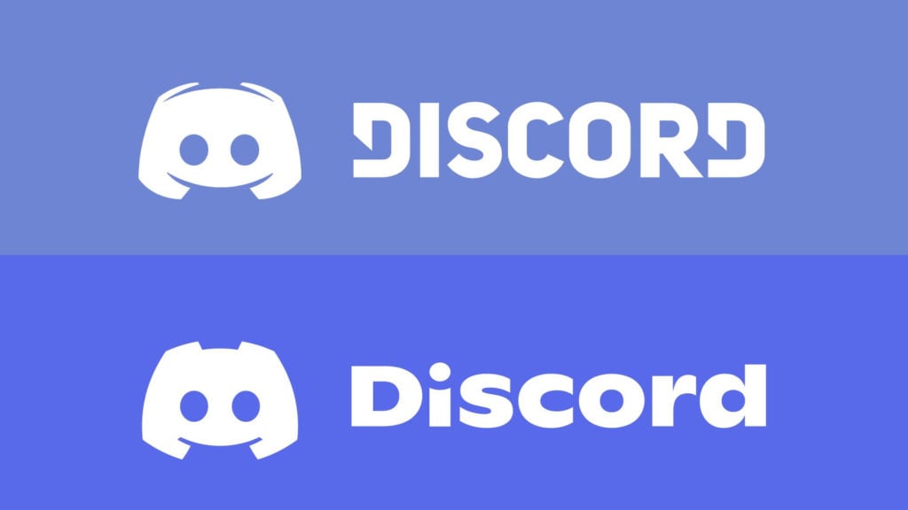
As for the font, it’s a custom font, as is the case with most large company logos, and it’s based on the Ginto typeface. The design team reportedly went through hundreds of fonts before deciding on this one, and it’s been receiving some mixed criticism on social media. You may also notice a new shade of “blurple,” as the company puts it; a mix between blue and purple. It’s brighter, and it’s more saturated, with the aim of bringing more energy to the overall aesthetic.
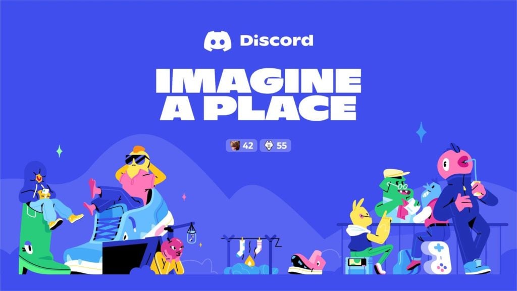
The company also has a new mantra: Imagine a Place. It’s something you’ll be seeing a lot of all over the Discord social media profiles, website, and tech properties. It represents the company’s goal of bringing people together around the world to create and collaborate.
In case you missed it, you can check out the official Discord Birthday Celebration on YouTube.
You can learn more about their entire process and everything that went into designing the new logo and picking a font on their official blog.






Published: May 13, 2021 04:34 pm